B13
Champagne Bollinger
The realisation
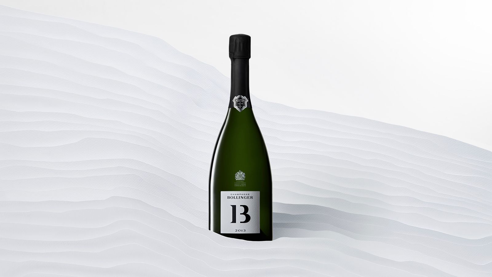
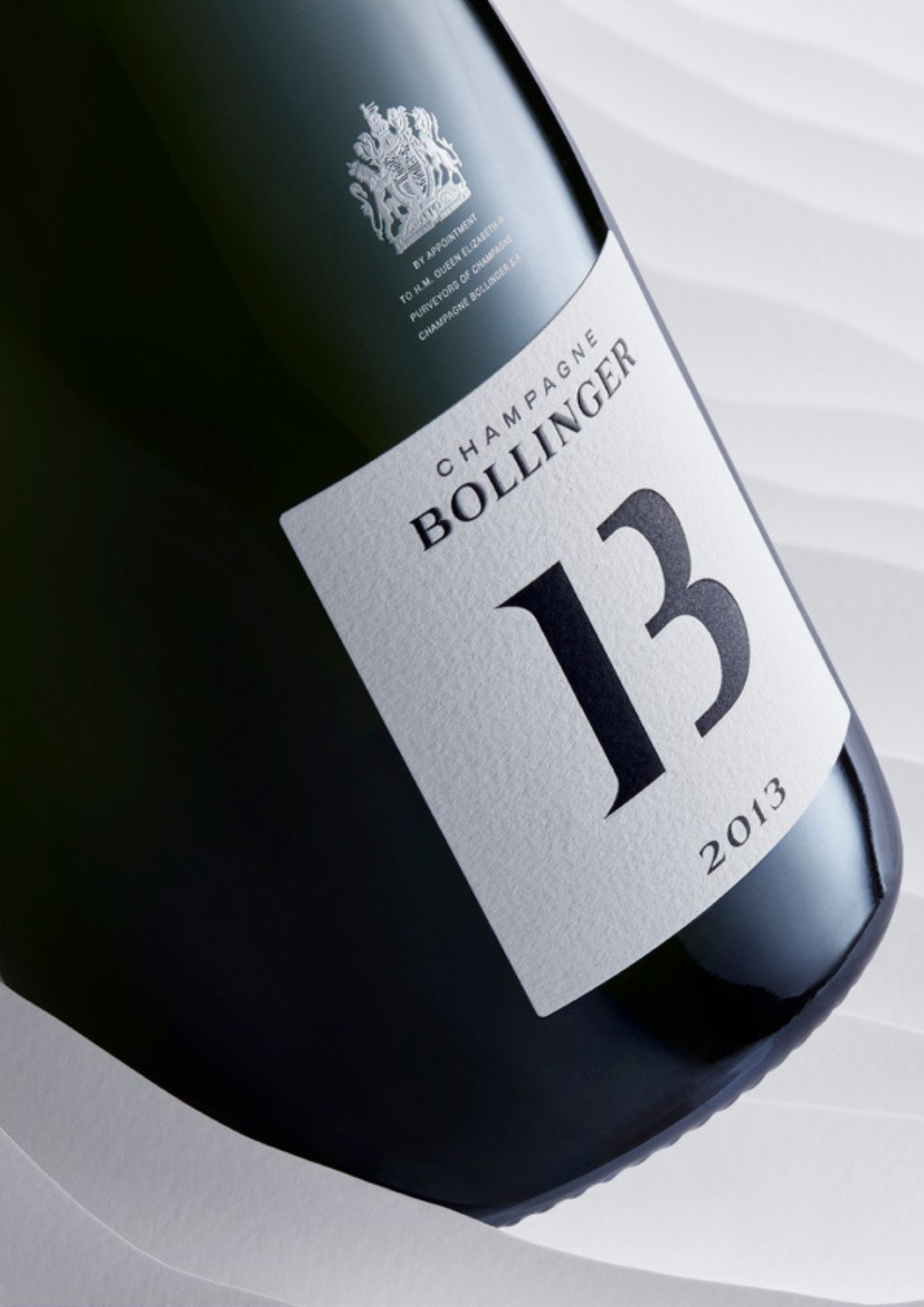
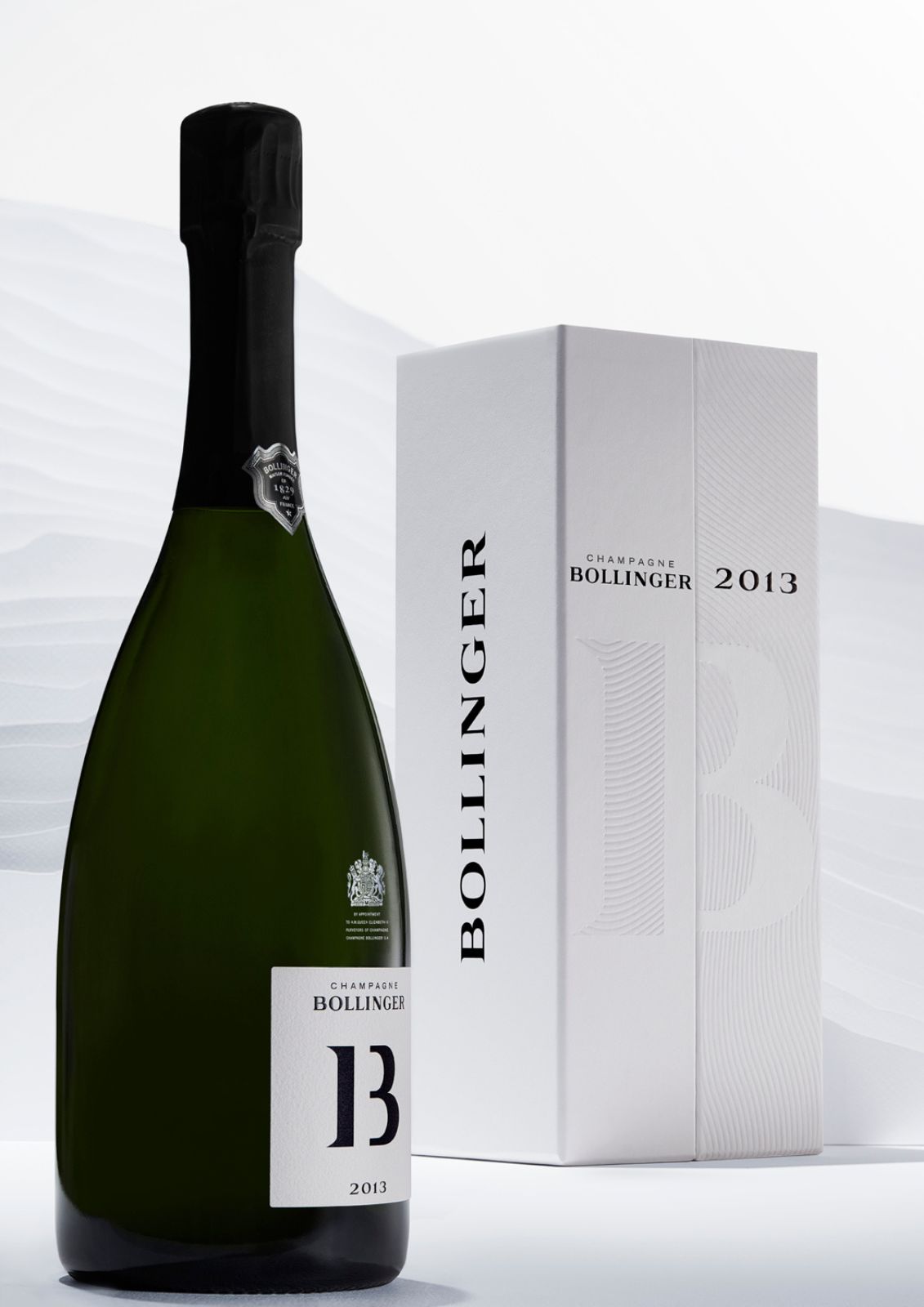
« B »: The initial of an esteemed house.
« 13 »: The golden number of an exceptional year, defined by unique weather conditions and a late harvest.
The name and emblem of « B13 » emerged in simplicity and clarity, through a layered interpretation.
This identity is accentuated by the contrast of black and white, recalling the snow and frost so characteristic of 2013 and the Pinot Noir grape.
The box design presents a precise interplay of lines, subtly mirroring vineyard rows and the chiselled profile of the wine. The textured elements also embody the complementary notes of this vintage.
The 360°
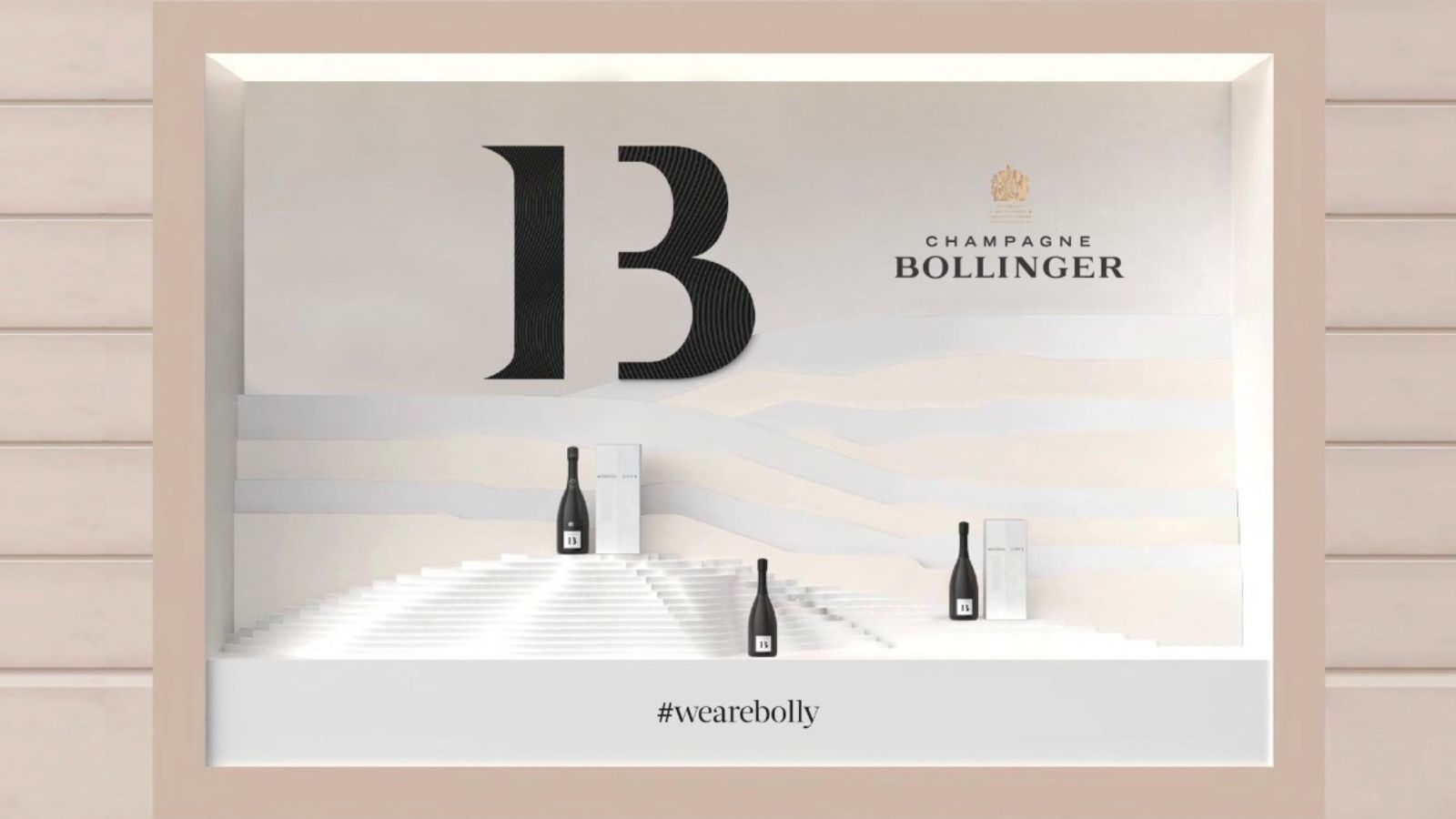
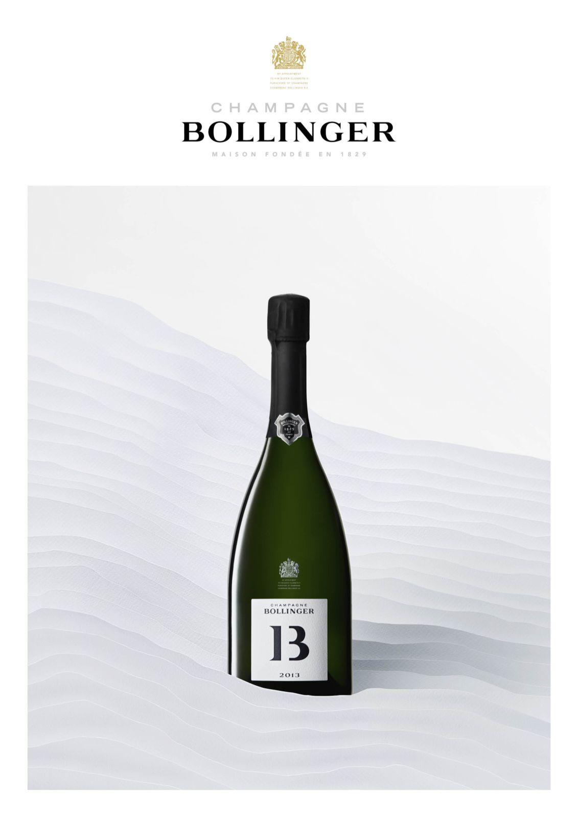
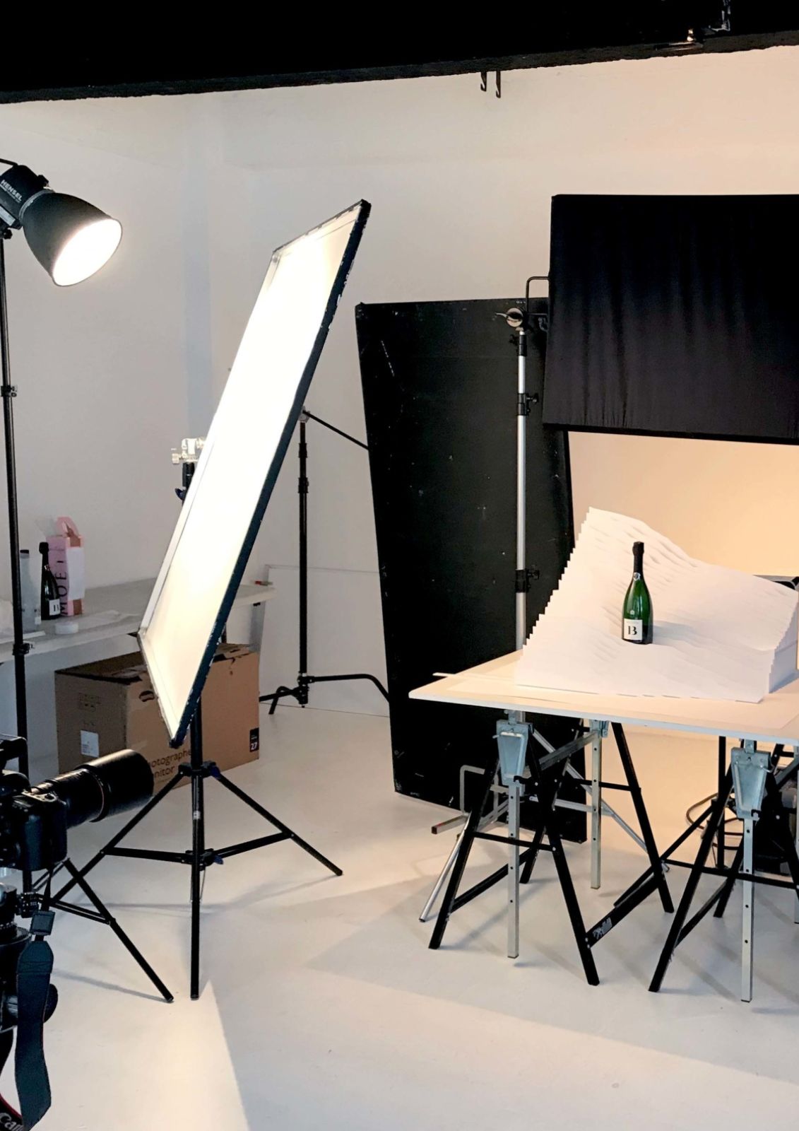
Echoing the identity and packaging work, the agency conceived a visual communication piece with scenography by a paper artist, blending abstraction with figuration to elegantly and simply capture the vineyard rows and rolling landscape of the montagne de Reims.
This tactile narrative is also conveyed through ‘box-in-the-box’ window displays, using a pop-up effect to add contrast and depth to the final scenography.
This tactile narrative is also conveyed through ‘box-in-the-box’ window displays, using a pop-up effect to add contrast and depth to the final scenography.
The sustainability
Using eco-friendly materials, emboss-only finishes, and minimising ink usage (without hot foil stamping), the agency created a 100% recyclable box, composed primarily from recycled materials. The moulded cardboard insert allows the box to be recycled without separating its components. Finally, production took place in France to reduce the carbon footprint associated with transportation.
Partisan du Sens supported Maison Bollinger throughout the technical development of the project, from sourcing eco-friendly materials to identifying responsible suppliers.
Partisan du Sens supported Maison Bollinger throughout the technical development of the project, from sourcing eco-friendly materials to identifying responsible suppliers.
